The Designer’s Guidebook Part Four:
Colour Theory in Design and Interiors
For our final post of 2019, we wanted to write about the one aspect that unites all of our designs – colour. Choosing a cohesive colour palette is essential when putting together any design, so we thought we would help you brush up on your colour theory, and give some of our top tips when choosing a scheme.
Colour Theory
 The principle of colour theory starts with the basic colour wheel, which includes 12 colours. These can be split into primary, secondary and tertiary colours, which when combined with a neutral (black or white) to change the tones, creates a whole spectrum of colours that encopasses everything you can imagine.
Definitions
Hue – The colour itself.
Tone – The brightness or darkness of a colour.
Tint & Shade – Tint is a hue with white added, shade is a hue with black added.
Image Credits: Tubik Blog

Primary – Can’t be made from mixing other colours – Red, blue, yellow.
Secondary – Can be made by mixing primaries – Green, orange, purple.
Tertiaries – Can be made by mixing primary and secondaries – teal (blue-green), amber (yellow-orange), and berry hues (red-purple) to name a few.
Types of Color Scheme
When studying colour theory, you come across a multitude of set schemes, with names such as triadic or analogous, referring to the chosen colours relationship to each other on the wheel. When we put together a colour scheme, we rarely use these, preferring to work more instinctively with what does or doesn’t go well together, which we will exemplify below.
Monochromatic Schemes

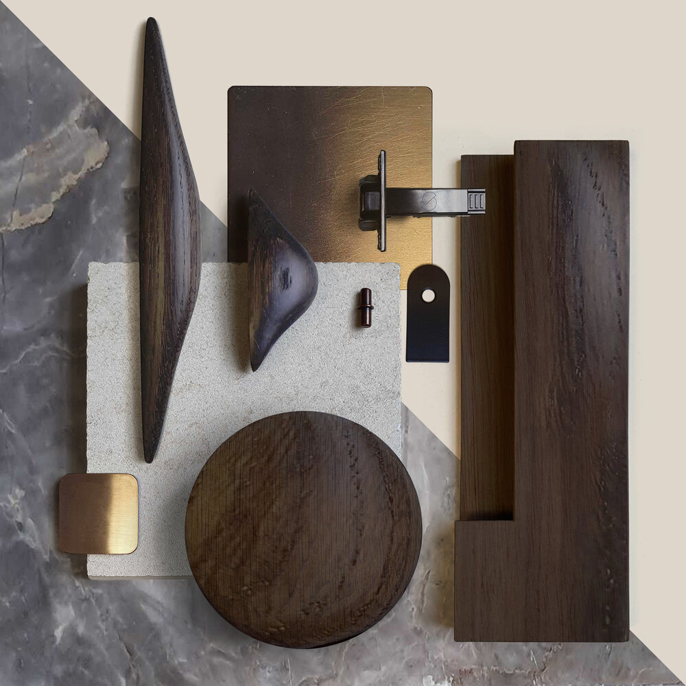
First up, is Monochrome Schemes – whilst the first thing that might spring to mind would be a classic aesthetic that relies solely on black, white and shade of grey such as shown above (in our recent stand for Hakwood and Kelly Hoppen at Decorex International), it is in fact any scheme that only uses one colour. The trick when using this scheme, is whilst you may only be using one hue, you should implement various tones of that hue to add visual interest. In addition, utilising ‘neutral’ materials, such as timber and stone, or grey and white paints (although be sure to choose the right undertone) can prevent the effect from becoming too overpowering.
Complementary Schemes


Our tips for choosing colours:
Take into account things that can’t be changed about the space – work around these elements such as the floor, or key pieces of furniture, as the colour scheme has to be sympathetic and complementary to these.
Think about the mood of the colour. Yellow for example is associated with positivity, and can add a sunny atmosphere to a space. It can be paired with a pale neutral to prevent it from becoming overwhelming, or a black to provide a bold contrast.
- Greens and reds work well in period homes, and are iconic of traditional English country homes.
- Blues and greens work well in kitchens and bathrooms, creating serene spaces.
If you’re unsure on choosing colours that complement each other, many of the big names in paint, such as Farrow and Ball, offer features where they show complementary colours to the colour you have chosen.
Always remember the aspect of the room – whether it faces North, South, East or West.
- North facing rooms have a colder light, be wary of using cool tones in these spaces as the effect can be amplified. For a true neutral effect, choose a warmer white with a yellow or red base. Darker hues will also help warm the space.


- East and West facing rooms have light that changes throughout the day. In westerly spaces, the light is cooler in the morning (similar to northerly), and warmer and brighter in the afternoon (similar to southerly). Eastern facing rooms are the reverse. To choose a palette for these spaces, consider when you will be using the room most, and choose a suitable palette using the recommendations for either Northern or Southern spaces.
We hope that this advice will help when you are next putting together a material palette for a space, and please share any creations with us via our socials tagging @shapelondon. If you would like any further advice on colour or materials, or to discuss your next project, please get in touch via our handle above, email mail@shapelondon.co, or give us a ring on 02072521560. Share this post via the button below to spread the word!
References
Related Articles
-

Are You Ready To Create Your Dream Kitchen?
Before you contact us, we need to ask you if you’re ready to create your dream kitchen – if the…
-

Are You Creating An Eco Friendly House?
-

The Best Kitchens London Has To Offer
At Shape, we are known for some of the absolute best kitchens London has to offer. While we are very…